A picture is worth a thousand words

Attract delegates with a striking graphic identity

apple
Your conference doesn't start on the opening day, but the moment your target audience sees your first communication. The graphic style is the most striking element, even before a word of the program has been read. After all, the visual language of the logo, color, visuals, and font works at lightning speed. In a fraction of a second, someone's brain decides whether your conference is worth their while.

A strong graphic identity is therefore not a luxury, but a strategic tool. If you focus on an attractive, coherent look and feel, you increase the visibility of your conference and the chance that delegates will ultimately attend. What's more, a clever graphic idea immediately opens the door to the message of your conference. The three examples below illustrate this clearly.

RTS Conference London 2018: match the graphic style to your conference domain

A visual identity for a media conference? It should be as closely aligned as possible with the world of television and digital content. This graphic style for the Royal Television Society Conference in London creates that authenticity in a highly recognizable way. The identity goes beyond traditional media and is also fully developed in motion.

UN Climate Change Conference UK2020: graphic style as a symbol for the content

The climate problem knows no boundaries. That message was carved into the graphic identity of the UN Climate Change Conference UK2020. The globe without countries or continents symbolizes the content of the conference and is therefore a powerful example of graphic communication. Here, too, the style is visually very recognizable.

the climate has no borders
taking world changing action
UN Climate Change Conference UK2020

ad:tech Tokyo: visual identity as a creative translation of the conference theme

How do you incorporate the theme of your conference into your visual identity? The ad:tech Tokyo conference translated “resilience” into a subtle balance between vulnerability and strength. The graphic embodiment of the theme made a complex philosophical concept concrete and understandable. Not only does this branding look beautiful, it was also translated into a consistent visual brand experience that reinforced the content of the conference.
Resilient 1
Resilient 2
apple

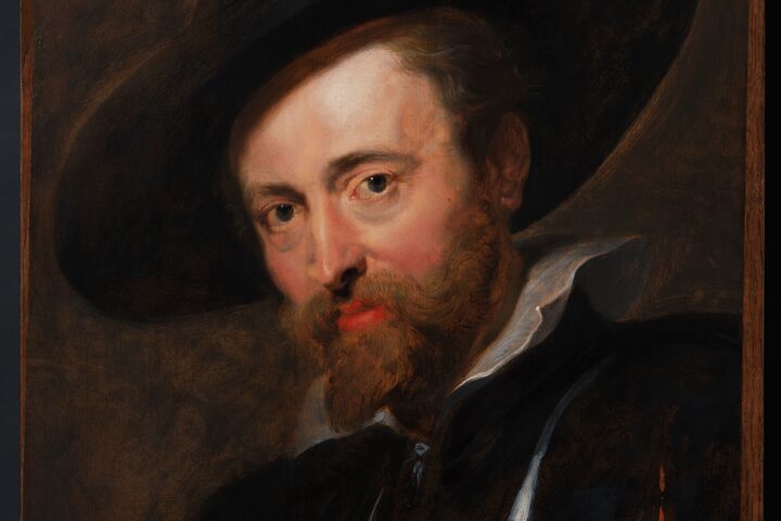
Speaking of graphic style, do you know who was a master of it? Peter Paul Rubens, the world-famous Flemish Baroque painter. So it's no coincidence that Flanders rolls out the red carpet for conferences in Culture & Heritage. Want to know more about how Flanders Convention Bureau can support your conference in this area? Dominique Jansen is happy to help.

RUBENS_zelfportret_FOTO NA restauratie © FOTO NA RESTAURATIE_9_Peter Paul Rubens, Zelfportret, Rubenshuis Antwerpen, opname 12 april 2018, na restauratie KIK-IRPA, foto KIK-IRPA Brussel

Free inspiration for your next conference

A successful conference is one that inspires. That’s why we offer you here tons of inspiration. For a conference in your domain, for your conference in Flanders.

Your contact person